flat refurbishment – part 5
The hallway… what can you say about the hallway? It’s not like the other rooms where a lot of consideration was needed to make things work the way I wanted. In fact it’s not really a room at all, more a collection of doors. But for me this was something that needed consideration, because in the hallway I saw an opportunity to make the flat feel more spacious that it actually is.
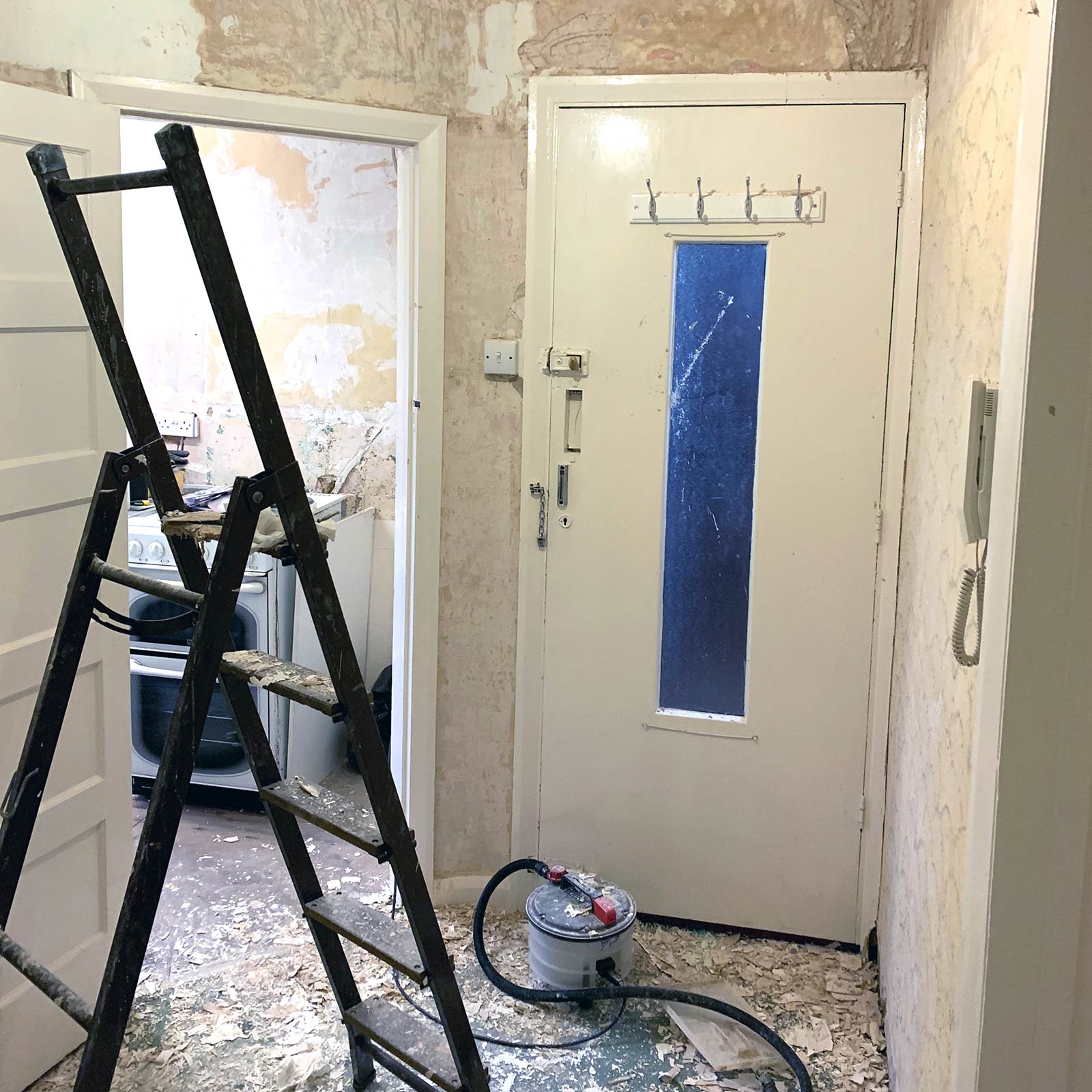
As with the rest of the flat there was wallpaper to remove from the walls and ceiling which didn’t take as much time as the other rooms due to the fact that the hallway doesn’t have much wall space at all.
At this point I also made the decision to keep the existing internal doors as they were original to the flat, but they did have an unsightly thick layering of gloss paint from years of re-coating! So whilst decorating the hallway I sent the doors away to be stripped back to bare wood and thankfully they turned out pretty well. I also invested in new door handles which I positioned higher up than they were before making the doors more comfortable to open.
The front door was another story though, this had to go! The new front door fits in well with the style of the flat keeping a look similar to the internal doors whilst also feeling very contemporary!
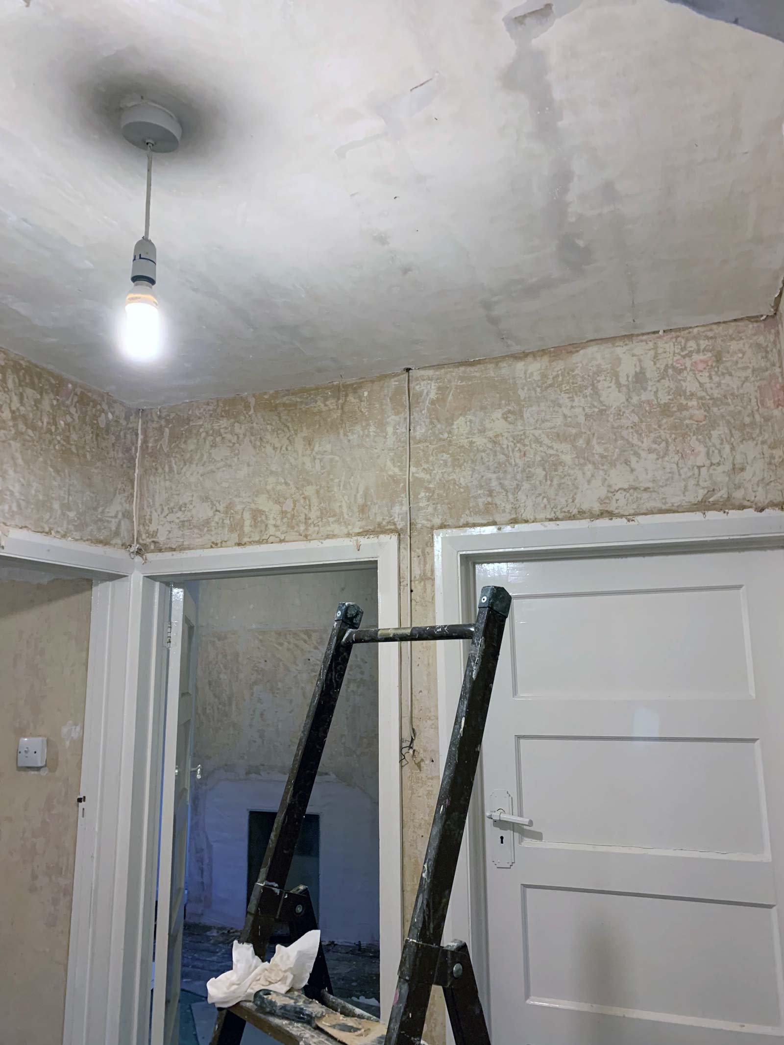
Stripping the walls and ceiling.
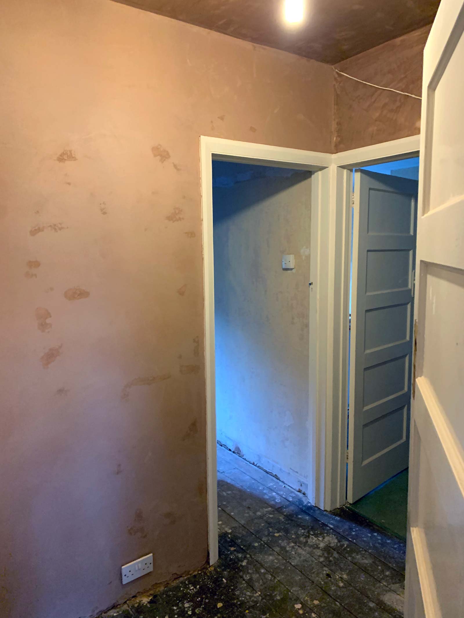
A smooth new skim.
As with the rest of the flat the hallway was given a new skim of plaster and then painted matt white to keep the flat as light and bright as possible. The hallway is the darkest area in the flat as it has no windows to let in natural light. Because of this I usually keep the kitchen and bathroom doors permanently open to let the light through and this is where I was able to enact my plan to make the flat feel more spacious.
I was conscious that if each room had a separate style of flooring then that would make the hallway feel like a small space. To combat this I decided to combine the flooring of the bathroom, kitchen and hallway so it felt like one seamless area. With the doors left open this does make the flat feel a lot more spacious and those areas feel much more connected. Because the kitchen and bathroom need a floor that is resistant to water it made sense to use tiles.
Thankfully the floorboards connecting all the rooms were on the same level which made it easy for the tiler to lay the tiles seamlessly throughout these three connecting areas. The black porcelain tiles I have used give the area a feeling of style and connectivity as well as being durable and practical! It also works really well contrasting against the light and bright colour scheme that has been used on the walls and ceilings.
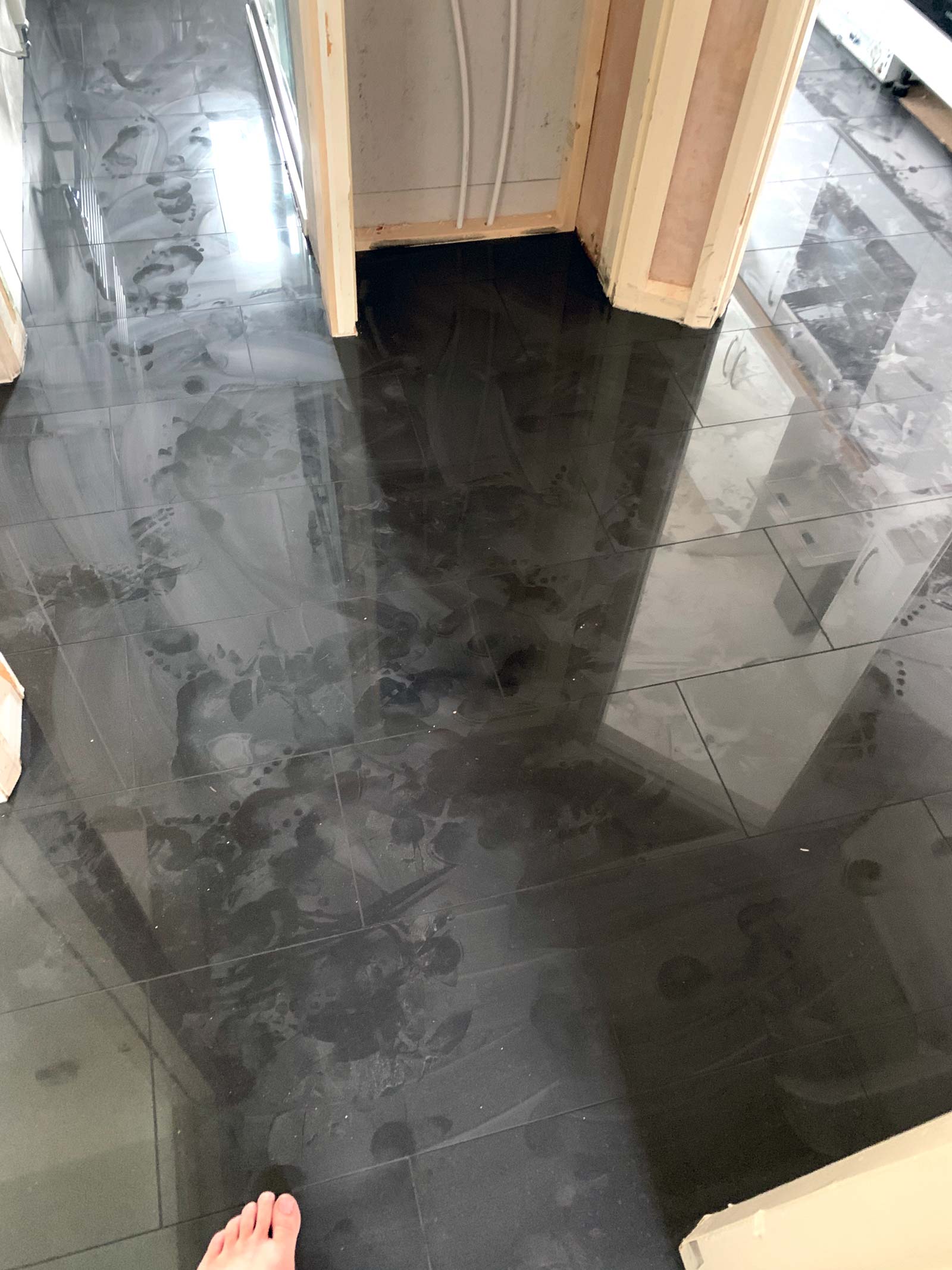
Tiles now laid needing a good clean!

A seamless beautiful connection.
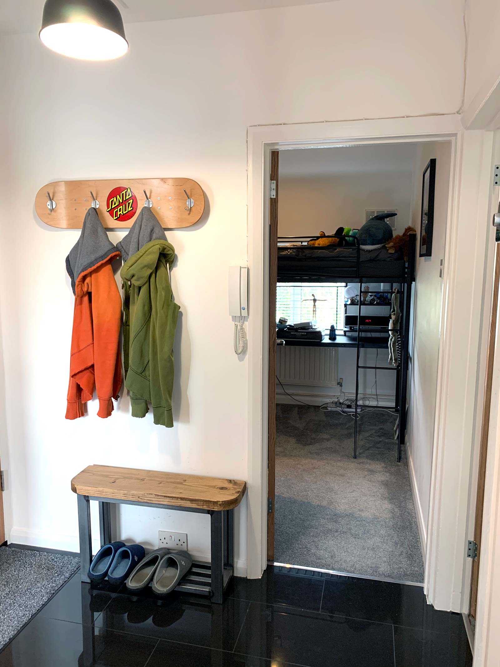
I love my skateboard coat rack.
All of the woodwork and skirting around the doors and flooring have been painted matt white throughout the flat to keep everything feeling consistent and fresh. The only proper design consideration for the hallway was the coat rack. I couldn’t find anything that I liked so I made my own out of a skateboard deck, you can see this in a separate blog I wrote about making it!
So now the flat was well on the way to completion, just the main bedroom and living room to tackle now…
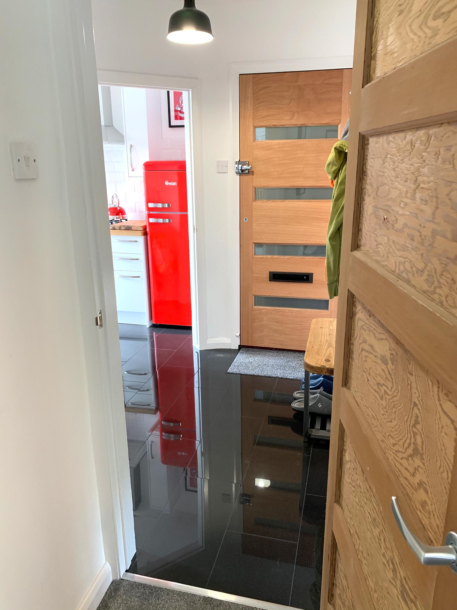
Loving the new front door.
